- Call us: (08) 8936 1499
- Email us: hello@dreamedia.com.au
14 Graphic design terms that most designers get wrong
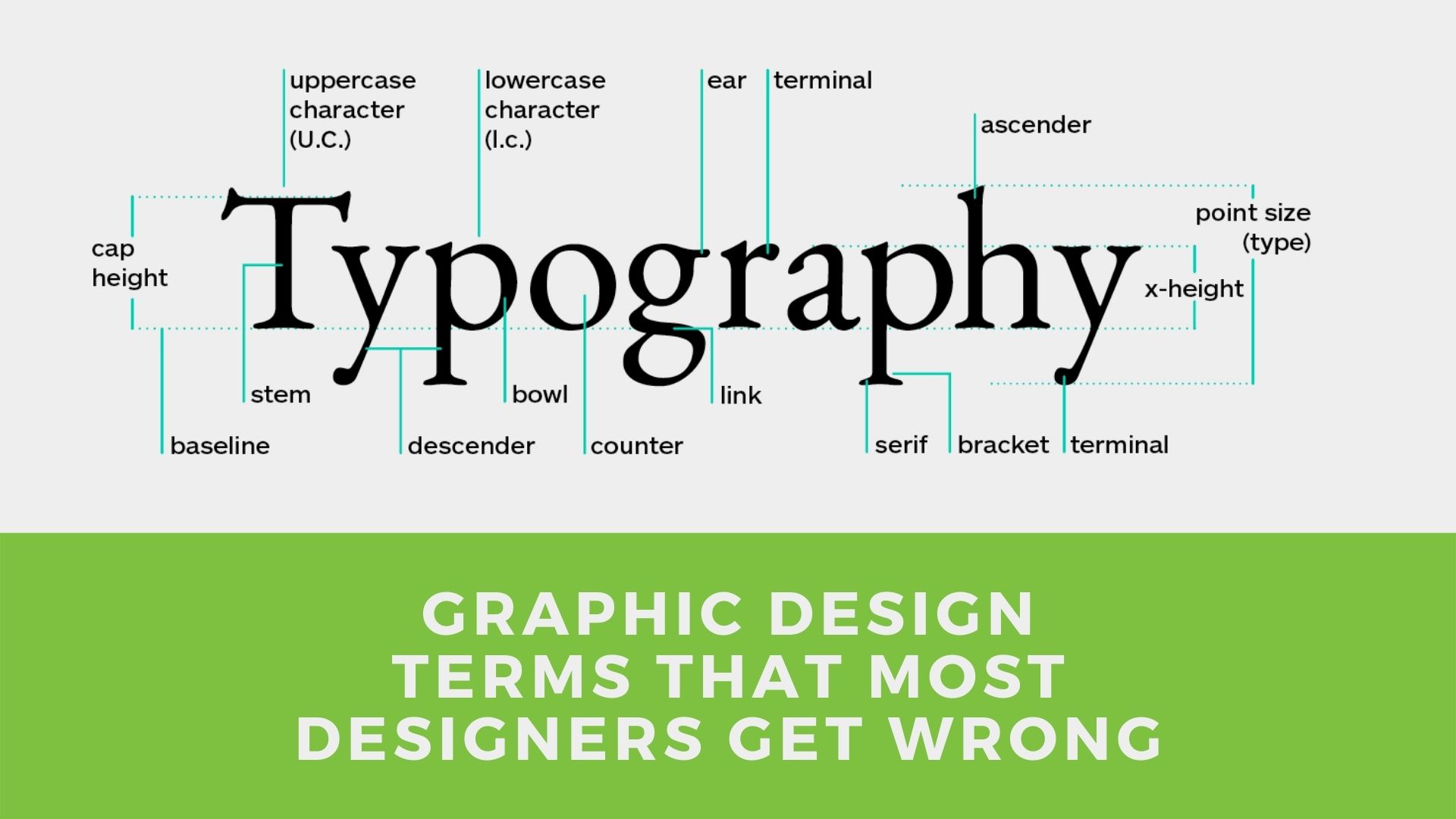
Do you know everything about graphic design? Test yourself with our article on the 14 graphic design terms that most designers get wrong!
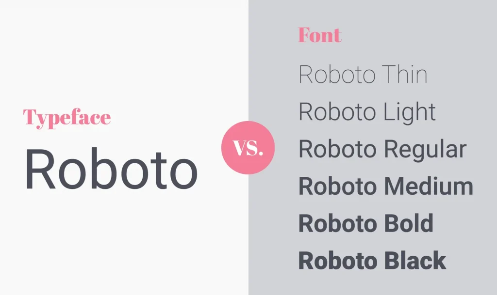
Typeface or Font?
A typeface is a writing style with letters shaped in a specific way – like Arial, for example. A font is the variation of weights of a typeface – such as bold, italics, and thin.
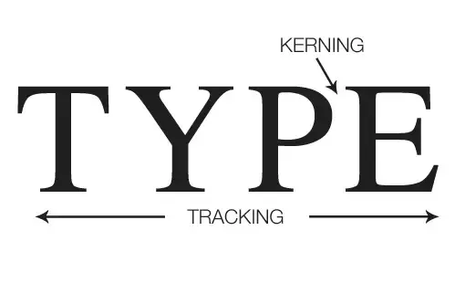
Tracking or Kerning?
Tracking is the typography technique of adding or subtracting the uniform space between groups of letters, whereas kerning is the act of adjusting the spacing between individual characters within a word.
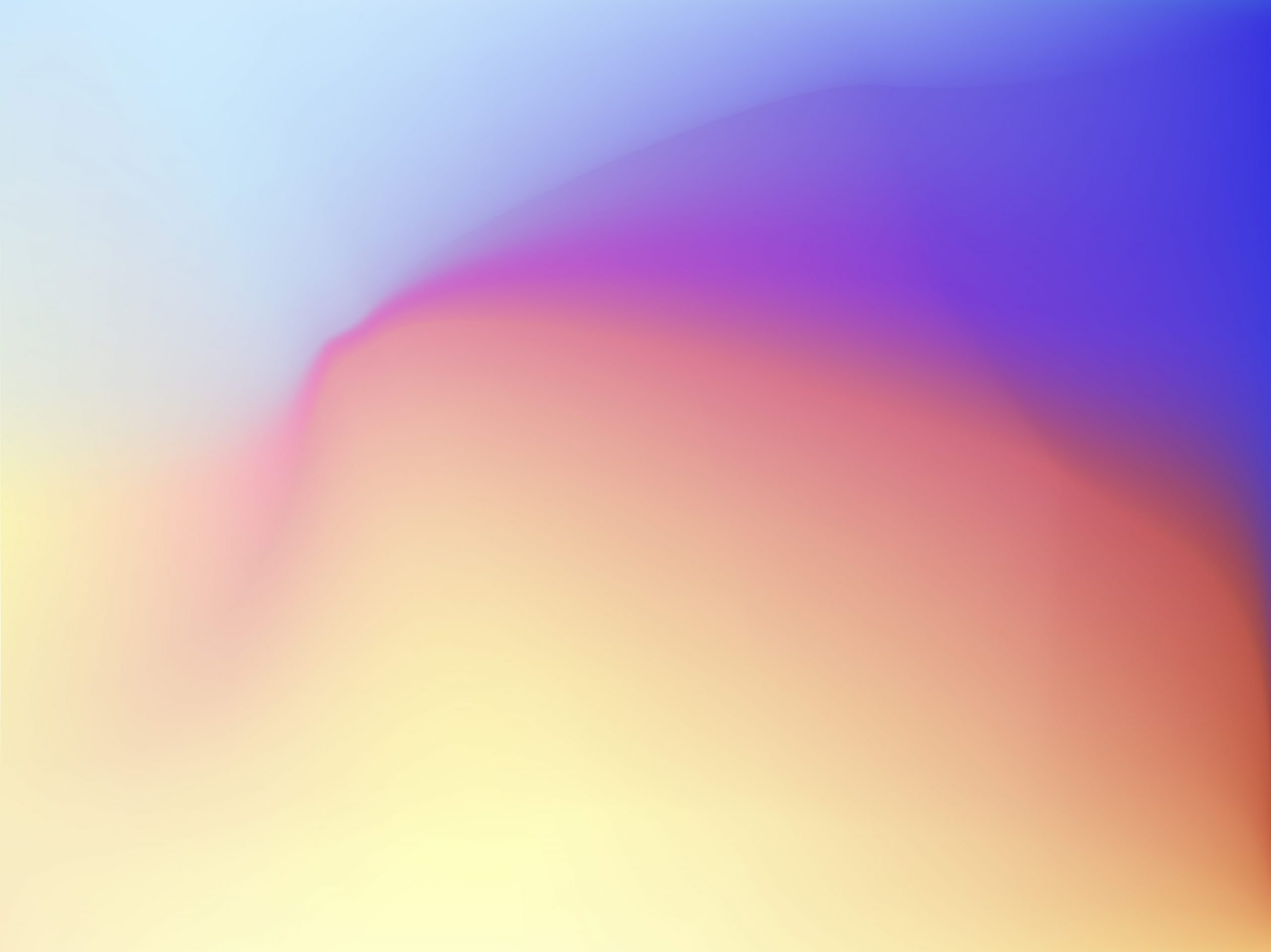
Gradient or Gradient Mesh?
A gradient creates a gradual transition from one colour to another across the surface of a shape, while a gradient mesh adds a mesh to a selected shape.
Backdrop or Background?
A backdrop is a simple sheet or cloth that is placed behind an object. A background is pretty much anything that is behind the main object of a visual piece.
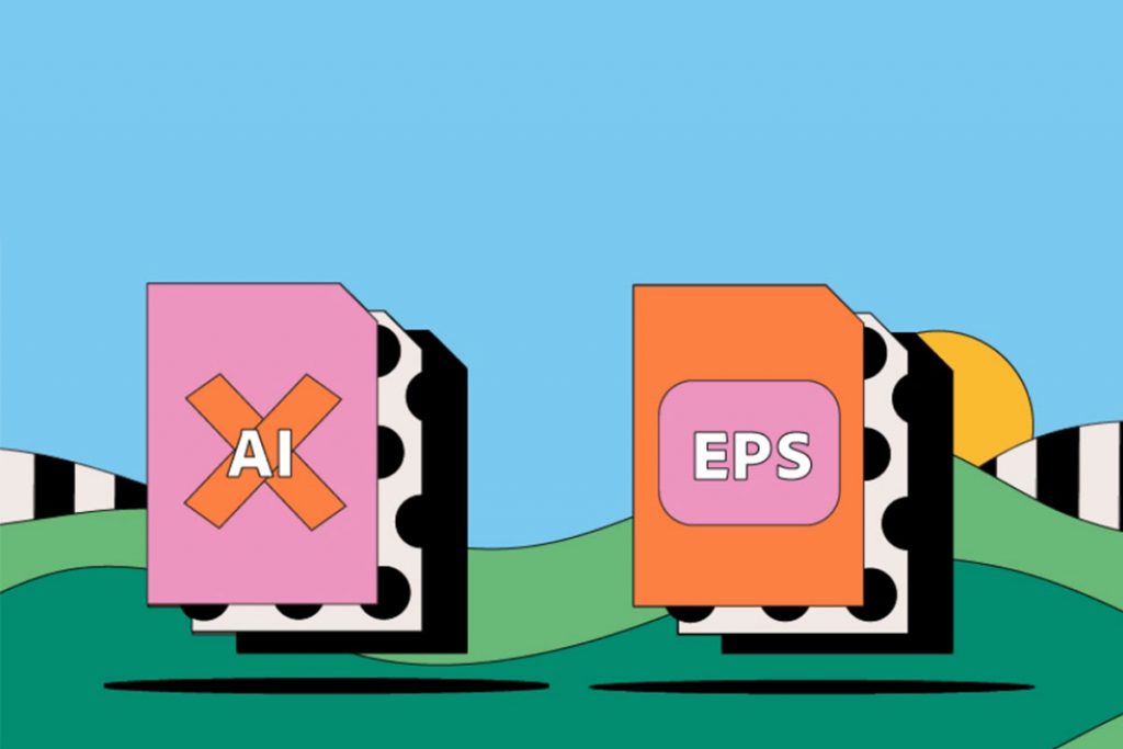
EPS or AI?
EPS is a file format that saves a flattened vector graphic without supporting transparency. AI is a file format that contains unflattened content and can be edited.
Tint or Tone?
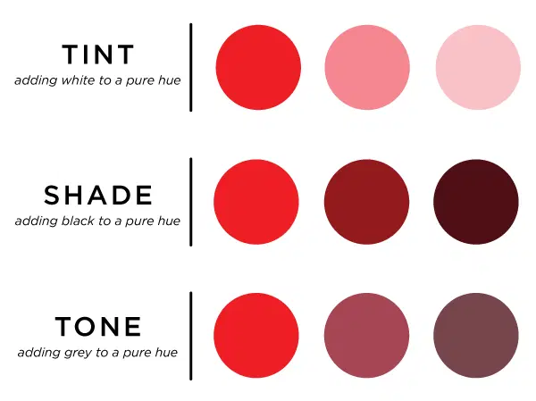
A tint is created by adding white to a pure colour, while a tone is a colour created by adding grey.
Lettermark or Wordmark?
A lettermark is a logo design with a specific typography style. A wordmark is a typography treatment used in text and logos.
Hue or Colour?
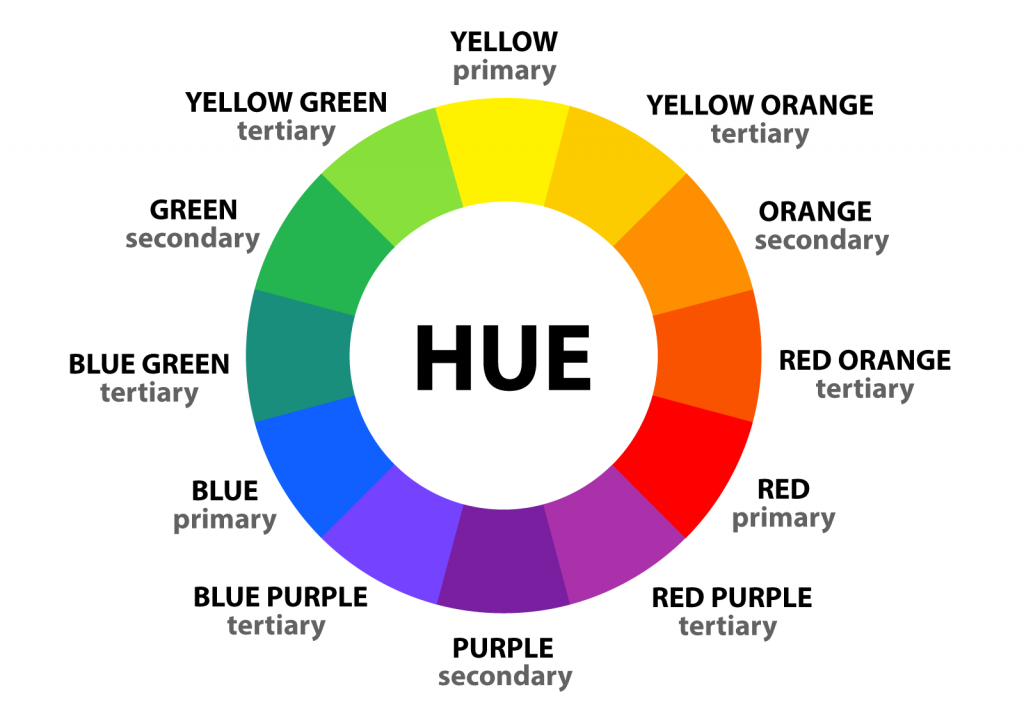
Hues are the purest forms of colour, such as red, orange, yellow, green, blue, and violet. Colours include hues, shades, tints, and tones.
DPI or PPI?
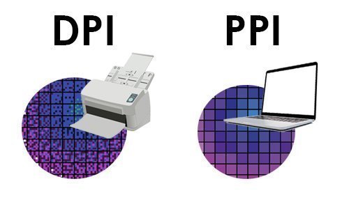
DPI refers to the number of dots per inch of a printed page, while PPI measures the pixel density of a digital image.
White Space or Negative Space?
White space is the part of a page that is left unmarked. Negative space is the deliberate action of leaving space around or within shapes.
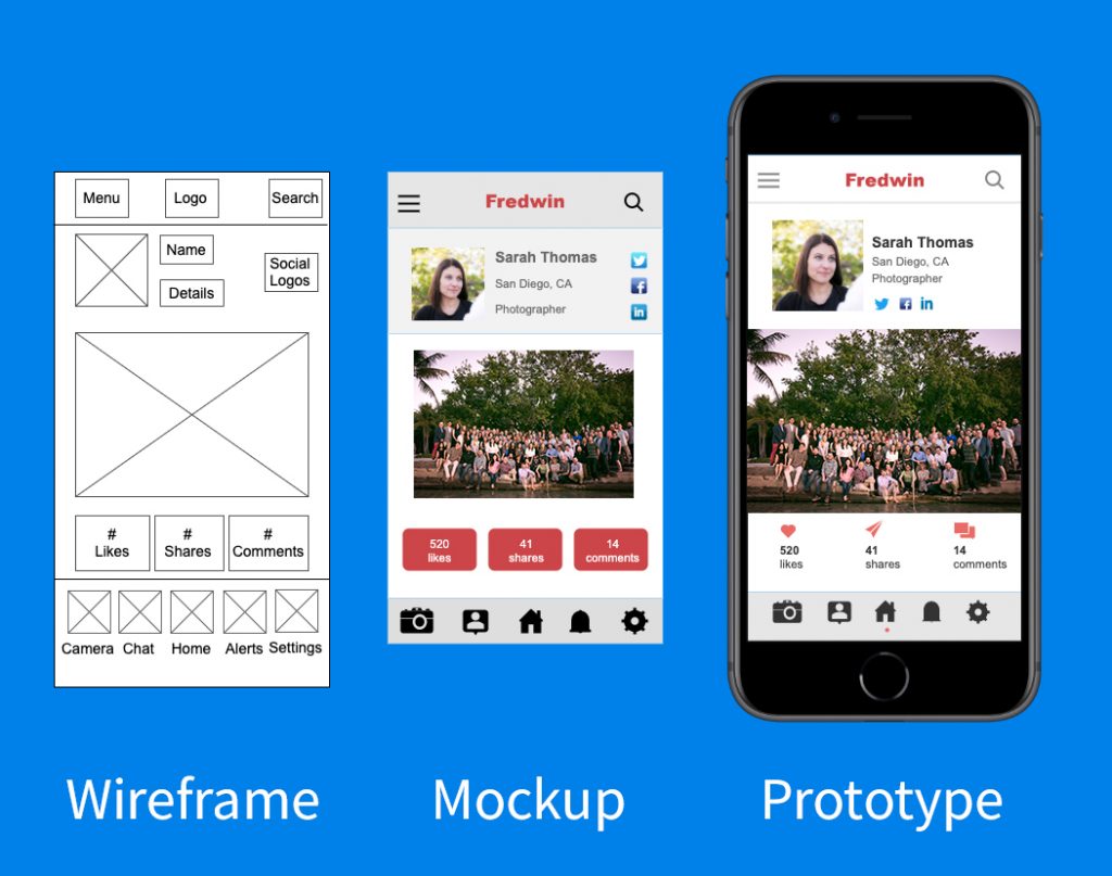
Wireframe or Prototype?
A wireframe is an artwork blueprint that helps structure the design. A prototype is the representation of your design before finalising it.
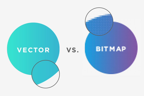
Bitmap or Vector?
A bitmap is an unresizable image made from a pixel grid. A vector is an editable image made from a mathematical formula.
Black & White or Grayscale?
B&W is an image made from pure white and black. Grayscale is an image with a range of values encompassing white-to-black tints and shades.
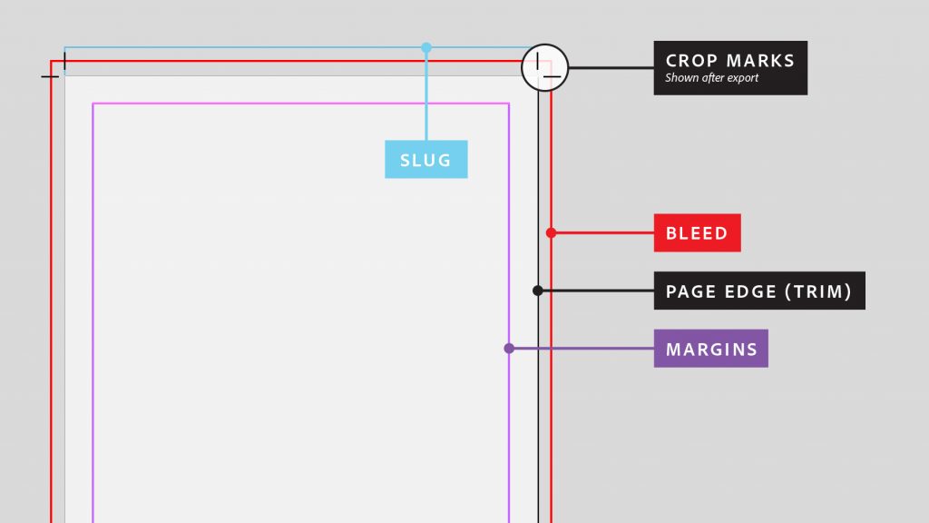
Cropping or Crop Marks?
Cropping lets you cut out the outer parts of an image, whereas crop marks are the lines added on the corners of an image that help printers with cutting and framing.
Related Articles
Best Drawing Tablets In 2022
A Guide to Designing a Logo
Latest Posts

THE NEW CANVAS: A FRESH LOOK AT GRAPHIC DESIGNING IN 2024
February 26, 2024

YOUR BRAND’S BEST FRIEND: VISUAL EFFECTS AND ANIMATION
November 14, 2023

Best Drawing Tablets In 2022
August 15, 2022
Categories

We are so happy you’re here!! We love our industry and we love sharing it with others, if you have a topic you would like to know more about send us an email or leave a comment below.


